
A potential customer is sitting in a parking lot, searching for a plumber, dentist, attorney, or local nonprofit on their phone. They tap your website, wait a few seconds, and find tiny text, an oversized image, and a phone number they cannot easily press. Most will not fight with the page. They will go back to search results and call someone else.
That is why mobile responsive websites for local businesses are not a cosmetic upgrade. They are a practical part of earning calls, appointment requests, direction requests, and new customers. If your site is difficult to use on a phone, it is putting a barrier between your business and people who are already looking for what you offer.
What a mobile-responsive website actually does
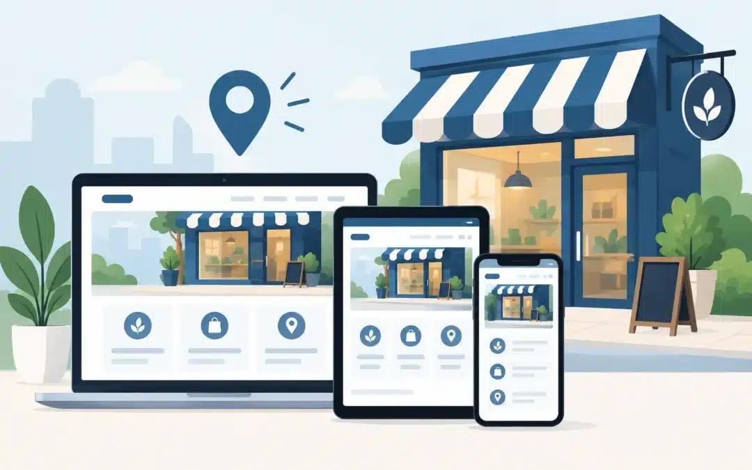
A responsive website adjusts its layout to fit the visitor’s screen. On a desktop computer, that may mean multiple columns, a wide navigation menu, and larger images. On a phone, those same elements should reorganize into a clean, readable page with simple navigation and clear actions.
Responsive design is different from simply having a website that technically opens on a phone. A page can load on a mobile device and still be frustrating to use. If visitors have to pinch and zoom, scroll sideways, hunt for contact details, or wait for oversized files to load, the site is not doing its job.
For a local business, the job is usually straightforward: help a nearby person understand what you do, trust you, and take the next step. That may be calling your office, requesting an estimate, scheduling a visit, filling out a form, or getting directions.
Why mobile responsive websites for local businesses affect revenue
Many local searches happen when the need is immediate. A homeowner may notice a leaking water heater. A parent may be looking for urgent care. A prospective client may be comparing law firms after work. These are not always long research sessions at a desk. They often happen on a phone, between errands, during a lunch break, or when a problem needs attention now.
A well-designed mobile experience removes friction at the exact moment someone is ready to act. Your phone number should be easy to find and tap. Your contact form should ask only for what you need. Service pages should quickly answer the questions a customer is likely to have: Do you serve my area? What do you handle? How do I get started?
Mobile usability also supports local search visibility. Search engines want to send users to pages that work well on the devices they use. There is no single design change that guarantees higher rankings, and strong local SEO still depends on relevant content, accurate business information, reviews, and competition in your market. But a poor mobile experience can undermine the value of all that other work.
The mobile problems that quietly cost leads
Business owners often discover a mobile problem only after a customer mentions it. By then, the issue may have been costing calls for months. A few common problems show up again and again.
Small text is one. If people cannot comfortably read a service description or office hours without zooming in, they are less likely to stay. Crowded menus are another. A desktop navigation bar with seven or eight options can become a confusing wall of links on a small screen.
Forms can be especially costly. A long form may be manageable on a laptop, but it feels like work on a phone. For many local services, a name, phone number, email address, and brief message are enough for an initial inquiry. You can collect additional details during the follow-up.
Slow pages create a different kind of problem. Large uncompressed images, outdated plugins, unnecessary scripts, and poorly maintained hosting can make a phone visitor wait. Some businesses need high-quality photography and visual impact, particularly in home services, healthcare, hospitality, or professional services. The trade-off is that those assets need to be prepared properly so they support the site instead of slowing it down.
Build each page around the next action
A responsive website works best when its content is organized for a busy visitor. That does not mean every page must be short. It means the most useful information should appear early, with a clear path to more detail for people who need it.
Start with a direct headline that explains the service or value you provide. Follow it with a short explanation, proof of credibility, and a clear next step. For example, a local HVAC company might lead with the service area and emergency availability. A medical practice might prioritize appointment scheduling, insurance information, and location details. A homeowner association may need meeting notices, governing documents, and an easy way for residents to contact the board.
Calls to action should match the decision a visitor is ready to make. “Call Now” makes sense for urgent repair work. “Request an Estimate” may be better for remodeling. “Schedule a Consultation” fits professional services. The wording matters less than clarity. A visitor should not have to guess what happens after they tap the button.
Make contact information impossible to miss
Put your phone number and primary contact action where people can find them quickly. On mobile, click-to-call functionality is especially useful because it lets someone call without copying and pasting a number.
Include your service area, hours, and physical address when they matter. If customers visit your location, a clear address and directions are essential. If you travel to customers, say which cities, counties, or regions you serve. This information helps people decide whether you are the right fit before they contact you.
Use proof where hesitation happens
Most visitors do not need a lengthy company history before they take action. They do need reasons to trust you. Brief customer testimonials, professional credentials, years in business, project photos, staff photos, and clear policies can all help.
The best proof depends on your organization. A contractor may benefit from project galleries and reviews. A nonprofit may need to show community impact and program outcomes. A professional firm may need to highlight experience, practice areas, and a straightforward consultation process. Responsive design should make that proof easy to scan, not bury it below a wall of text.
Do not treat mobile as a one-time website project
A site can be responsive when it launches and gradually become less effective as content changes. Someone uploads a huge image, adds a complicated pop-up, changes a form, or installs a tool that affects page speed. Regular maintenance keeps small issues from turning into lost opportunities.
This is one reason ongoing website support matters. Security updates, backups, performance checks, content updates, and form testing are not glamorous, but they protect the asset your business relies on for visibility and leads. Before a busy season, it is worth checking your most important pages on an actual phone, not just in a desktop preview.
Test the basics: Can someone call you in one tap? Is the main service clear without scrolling too far? Do forms submit correctly? Are menus easy to use? Does the page load quickly on a cellular connection? Ask someone who is not familiar with your business to try it. They will spot friction that you may overlook because you already know where everything is.
WordPress, Weebly, and the right fit for your business
Both WordPress and Weebly can support a mobile-responsive website when they are built and maintained correctly. The better choice depends on your needs, budget, growth plans, and how much flexibility you need.
WordPress is often a strong fit for businesses that need more customization, deeper content, specialized functionality, or room to expand their marketing over time. It requires responsible maintenance, but it can grow with a business.
Weebly can be a practical option for organizations that need a professional site launched quickly with a simpler setup. It is not automatically limited to basic results. Thoughtful page structure, on-page SEO, and direct HTML or CSS adjustments where appropriate can make a meaningful difference. What matters most is not choosing a platform because it is popular. It is choosing one that supports your goals without creating unnecessary cost or complexity.
HD Marketing builds and supports both types of sites because local businesses do not all need the same solution. A good recommendation starts with what you need the website to do: bring in calls, support local search, generate appointments, share information, or provide a dependable foundation for future marketing.
A mobile-friendly site will not replace good customer service, competitive pricing, or a solid reputation. It will make it easier for the people already looking for you to take the next step. When your website is clear, fast, and easy to use from a phone, it can keep working for your business long after the office closes.

Recent Comments